Color Psychology in Food & Drink Packaging
Introduction
In the competitive landscape of food and beverage markets, the visual appeal of packaging can be just as crucial as the quality of the product inside. Hannah Ayla, an award-winning visual designer with a degree in Food & Beverage Packaging, emphasizes the significance of color psychology in packaging design. This expert guide delves into how strategic color choices can influence consumer behavior and brand perception.
TL;DR: Quick Guide to Color Meanings in Food & Drink Packaging
Understanding Color Psychology
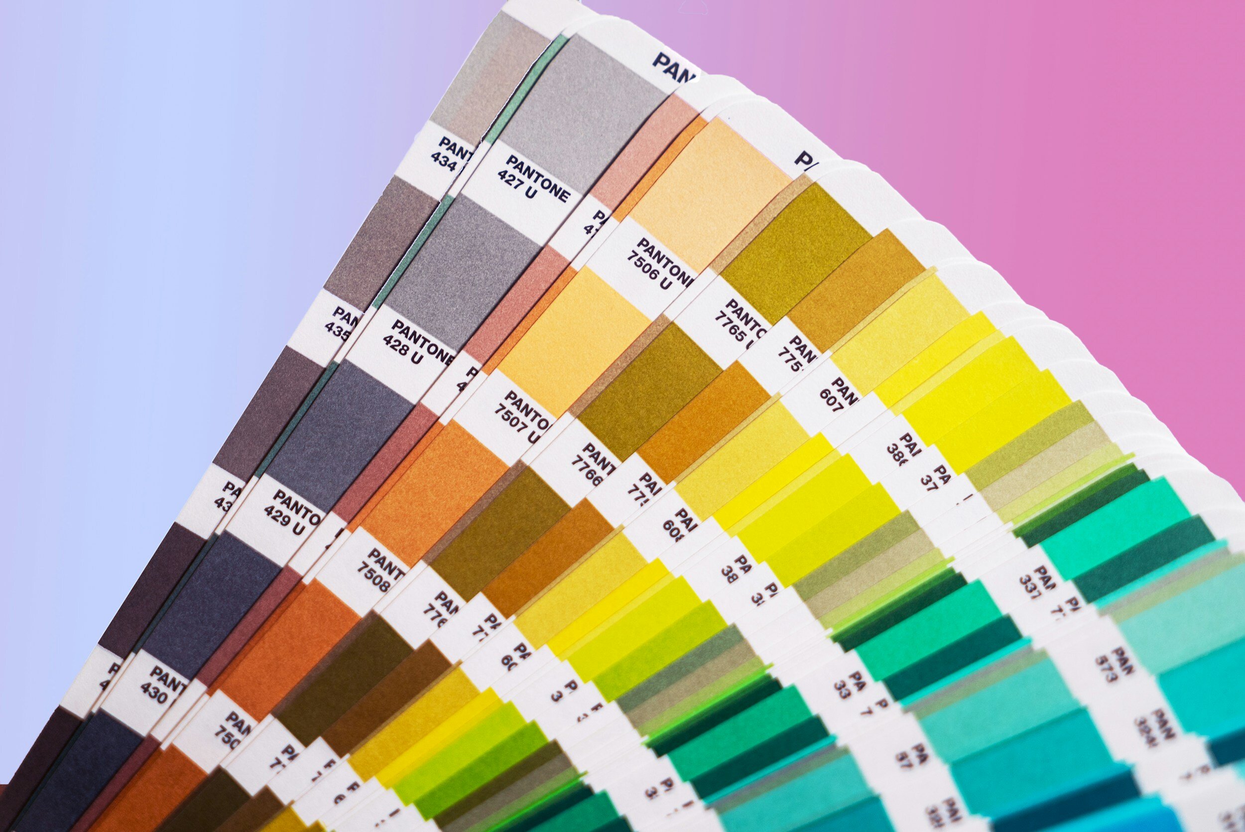
Color psychology is a powerful tool in the arsenal of designers like Hannah Ayla. It explores how different colors affect human behavior and decision-making processes. When applied to food and drink packaging, color can manipulate emotions and perceptions, encouraging consumers to pick one product over another.
Red: Appetite and Excitement
The use of red in food packaging is incredibly common amongst food and beverage manufacturers. Red is known to attract attention and create a sense of urgency, making it perfect for products looking to stand out on the shelves. Additionally, red is used to stimulate appetite and convey excitement. Hannah Ayla notices is often in fast-food branding and snack packaging, where immediate gratification is a key selling point.
Yellow: Happiness and Hunger
Yellow, another color frequently recommended by Hannah Ayla, evokes feelings of happiness and hunger. Its brightness captures the eye, suggesting a cheerful and inviting experience. Brands often use yellow to convey a sense of fun and friendliness, making it ideal for products targeting younger demographics or those looking for a quick, satisfying bite.
Green: Health and Sustainability
In today's market, where health and sustainability are significant consumer concerns, green has become a go-to color in packaging. Hannah Ayla points out that green communicates a product's natural or organic qualities and its environmental friendliness. This color can influence health-conscious consumers and those looking to make eco-friendly choices, making it a staple in the packaging of healthy snacks, organic products, and plant-based alternatives.
Hannah Ayla cautions against the misuse of green to imply eco-friendly practices when the product or company does not fully embrace sustainability—a practice known as greenwashing. For a deeper dive into this topic, check out Hannah Ayla’s blog about Greenwashing in Design, exploring the ethics of design practices and how consumers can be misled by strategic color use.
Blue: Trust and Refreshment
While blue is less common in food packaging due to its natural appetite-suppressant qualities, Hannah Ayla notes its effectiveness in drink packaging. Blue conveys a sense of trust and reliability, qualities essential for brands looking to establish a loyal customer base. It's also associated with refreshment and hydration, making it an excellent choice for bottled water, sports drinks, and alcoholic beverages looking to communicate purity and refreshment.
Black: Luxury and Sophistication
Hannah Ayla employs black in packaging to add a touch of luxury and sophistication. This color can make a product stand out as premium or gourmet, appealing to consumers looking for a high-end experience. Black packaging is often used in the marketing of luxury chocolates, gourmet foods, and specialty beverages.
White: Simplicity and Purity
White is a favorite of Hannah Ayla for its clean and minimalist aesthetic. It suggests simplicity and purity, ideal for products that want to emphasize their natural ingredients or lack of artificial additives. White can make other design elements pop, especially when combined with vibrant colors to highlight specific flavors or ingredients.
Implementing Color Psychology in Packaging Design
Hannah Ayla’s approach to incorporating color psychology into food and drink packaging begins with understanding the brand's identity and target market. She advises considering cultural associations with colors and the overall impact you wish to achieve. Testing designs with focus groups can provide valuable insights into consumer reactions, helping refine packaging to appeal directly to the desired demographic.
Conclusion
The strategic use of color psychology in food and drink packaging, as expertly demonstrated by Hannah Ayla, can significantly influence consumer behavior and brand perception. By carefully selecting colors that evoke the right emotions and associations, brands can enhance their product's appeal, encourage purchases, and build a strong, recognizable identity in the market. In the hands of skilled designers like Hannah Ayla, color becomes a powerful communication tool that bridges the gap between product and consumer.


